Illogicopedia:Enhanced recent changes
This is my idea for a system for a much easier rc to administrate under, and to follow changes on each page like the nested system without destroying the time flow of the edits.
Features[edit | edit source]
- Lines linking each edit on the same article
- Separate lines on the right hand side for logs.
- details displayed which are easy to read, but do not clutter the screen with overwhelming data
Specification[edit | edit source]
Basic interface[edit | edit source]
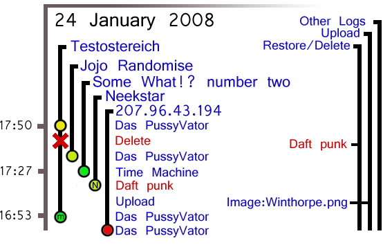
Lines link articles to show where mulitple edits have been made, clicking on the article link, links to the article itself, while clicking the user links to the userpage, hovering the dot brings up extra details and clicking the dot brings up an edit difference page.
Changes on Design - top diagram[edit | edit source]
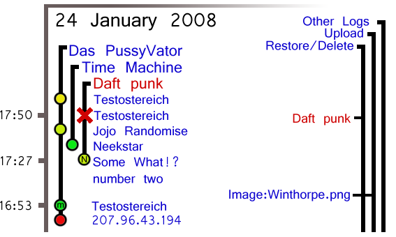
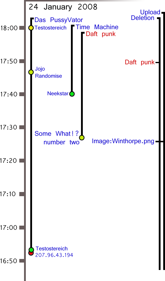
A few layout changes have been made, the bottom diagram shows the design on its original state, while the top shows the idea in a refined layout. It is possible to make the left hand side alot like the logs section on the right hand side, although this will cause crossing lines, overall, it could have a simplifying effect on the design. this is because text would not be floating around inside lines. another idea is to have an option to default to a line for each active user, rather than page, because on some wiki's have alot of different page edits. A wiki such as Illogicopedia is a perfect example of a wiki with a large article base, and concentrated activity with its edits over a large number of pages. This means things like edit wars and spammers. While a page defaulted layout is much more suitable to track page reverts in a vandal attack. Also, because edits become slightly less clear, when a line is rolled over, the line, the article heading, and the user name edits become bold for clear definition.
Time-scale[edit | edit source]
The timing is scaled which is constantly flexible to display the most amount of data without being overly confusing. The system could me made so as to make the edits on a line per line basis rather than on a time-scale system (the top diagram demonstrates this). this would eliminate the need for a scale, make it less confusing, but the timing data would be lost, as a compromise, every fifth or sixth edit, the time could be added on the scale to the side, this removes any white space that could appear, while preventing any overlaps that could occur, cutting down on code.
Coloured centres[edit | edit source]
The centres of the dots indicate a rough scale of the number of bytes added. This works on a scale from Red through yellow to green. Red being a large number of bytes removed, and green being a large number added. This should be done using both a ratio and a pre-set value, so when alot of small edits are being made, or a wiki contains lots of small edits, then it adjusts to fit, but not so dramatically, that edits of +7 bytes show as the extreme green. If however the bytes added or removed are low but the number of bytes changed is very high, the centre dot would display a scale of very light to very dark blue, to indicate that a large amount of data has been replaced. This would only come into effect though if the amount of bytes changed was largely different from the added/removed value.
Extra details lost[edit | edit source]
Because my design loses details, such as exact byte numbers, talk pages and block links, Each dot, while hovered, will display this information inside a floating box. This will contain: Bytes changed, user, user talk page, block user (admins only), edit summary, link to difference with last edit page and a link to the article. Other data could also be placed into this box without cluttering the page, for larger wikis, editcounts from the user, with a colouring of their byte count, could be useful to identify blankers quickly, but would take up more server recourses, editcounters already exist, but a user byte count does not seem to be apparent to the current versions of mediawiki.


